The market for data visualization was pegged at $8.85 billion by a Fortune Business Insights survey back in 2019. With a compound yearly growth rate of 10.2%, the market is now projected to be worth $19.20 billion by 2027.
Data visualization is critical to an organization that relies on data. Data is transformed into images, which makes it simpler to interpret, take in, and use for crucial business choices. Your team may not have discovered these useful insights without data visualization. Data visualization tools hence are the need of the hour.
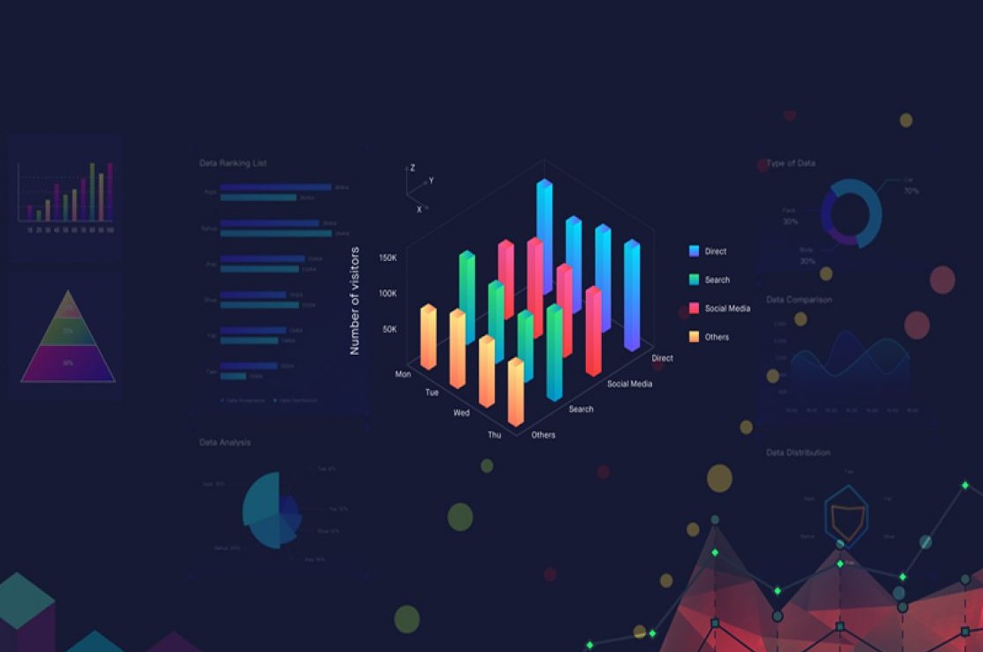
They are part of an industry that is worth 8 billion and growing. These are tools that make it possible to visualize data for better communication. Choosing the perfect type of visualization for your audience is vital whether you’re creating a stunning chart or an engaging presentation.
However, it may take research and comparison to determine which tools are the best for you. So, what steps should you take to communicate your data’s meaning & your intended message? Start with the appropriate tool! Although many different tools and types are available, each with a unique price & quality level, here we list the top 10 best tools available for everyone in 2022!
Now that we know why data visualization tools are the need of the hour, let’s look at the top 10 data visualization tools in 2022!
Datylon for Illustrator could be your best option if you’re a graphic designer or data visualization specialist who frequently creates charts and graphs in the Adobe environment. Being a no-coding tool, it enables complete design flexibility.
The tool is crammed with so many styling options that you may precisely adjust even the tiny aspects of your design. It is undoubtedly the best tool for producing lengthy, multi-page data tales when used in conjunction with Adobe Indesign.
It has a growing library of 120+ fully customizable chart templates and gives a free version with the option to export your design to the Datylon web app.
Look no further if you’re seeking a simple tool that doesn’t sacrifice quality and enables you to connect people and data. This unique French dashboard analytics development tool is code-free.
To eliminate the friction that exists between people and data, Toucan Toco was created as a fully cloud-based, end-to-end analytics platform. With the help of Toucan’s AnyConnectTM, a collection of hundreds of included connectors, users can connect to any data, whether it is stored, streamed, or based on another platform.
With the help of Toucan Tuco’s unique options, preparing data, linking data, and creating and deploying dashboards are all made incredibly simple. It is allegedly so simple that “no end-user training is required.” Sadly, there is no free version available.
Another online tool for visual content design is Visme, which enables you to generate everything from printables and mockups to extensive data visualizations. The tool offers an attractive and user-friendly drag-and-drop user interface. You will be pleased to hear that Visme provides a wide variety of themes and ready-to-use visuals if you intend to create an infographic or a presentation.
To engage your audience, you can alter the colors and headings, use charts, and add logos. A wireframe tool is another fantastic feature that can be especially intriguing to individuals looking to test their UX design abilities.
There is a good probability that you are familiar with Canva if you have ever needed to design practically anything but are not a designer. By providing a superb online graphic design tool with so many capabilities that you might retire before we finish naming them all, the company completely disrupted the software sector.
Anyone can use Canva, regardless of their skills or level of digital proficiency. It includes everything from limitless image and video stock banks to some strong photo editing features, and it is intuitive and simple to use.
A fantastic, free tool for data visualization, Google Data Studio enables you to create attractive, personalized reporting & interactive dashboards.
Google Data Studio, a part of the Google Analytics product line, is excellent for converting raw data into reports and dashboards because it is one of the few free data visualization tools available. Although it lacks some other tools, templates & organizing, it is still entirely free and offers all of its features.
For those who are creating reports for customers, Whatagraph is a fantastic option. Whatagraph is a vital reporting tool for all types of customers, from in-house marketing teams to small agencies, despite the name suggesting a graph builder. Its format is simple to use and understand.
It facilitates the collection of data & generates graphs and charts for you automatically. Whatagraph’s reports can also be easily comprehended by a wider audience, which is another vital benefit.
Used by many enterprises, supported by Salesforce, and easily integrate-able with Slack, Tableau is a well-known leader in the business intelligence software sector and an established industry powerhouse with impressive data visualization techniques. Data analytics is the focus area of attention.
Tableau offers various products & each designed with a specific target market and uses case in mind. Anyone may use Tableau to visualize data with one of the best tools available, whether they are a person or a team working within a massive enterprise. However, there is a rather steep learning curve to consider.
For large enterprises and others who want to employ augmented analytics to evaluate data, Qlik Sense is the perfect data visualization application. In contrast to previous data visualization tools, it provides a greater level of interaction, context, lightning-fast calculations & the capacity to integrate and mix data from hundreds of data sources. It succeeded “QlikView,” which was a similar (but smaller) visual analytics tool.
Flourish Studio is an exciting tool for creating fascinating interactive data visualization techniques if you want to liven up your project. It provides various charts and graphs, from straightforward to complex variations, similar to Datylon for Illustrator.
A rather generous free edition with access to numerous themes and functionality is available from Flourish Studio. This London-based business has merged with another industry titan in design to become a member of the Canva family.
Power BI is an effective tool for data visualization that is provided by none other than Microsoft. It’s a good tool for less tech-savvy consumers because it’s simple to use and intuitive to understand. Power BI can be deployed on cloud infrastructure or installed locally.
In the current scenario, Microsoft is among the best and most comprehensive tools available. Numerous databases are supported by it, including Teradata, Salesforce, Oracle, PostgreSQL, Google Analytics, Azure, and many others.
Many different sectors and industries employ data visualization. It’s prevalent in various fields, including business, health, and education. Choosing the right data visualization tool can be difficult because you will also explore a range of tools that can make it much simpler to present data in a clear, illuminating, and powerful way.
However, data engineering and transformation tools work together to give you chances to increase the capabilities and reach of your business, and that’s where TechMobius can help.
Any business that wants to succeed at the highest levels must adopt a new mindset and view the world through the big data lens, and we have the expertise to make that happen. We make sure you choose the right tool and witness new successes. Reach out to TechMobius to reinvent your business with data engineering!
© Copyright 2026 TechMobius – A Mobius Knowledge Services Division. All Rights Reserved.